 |
| Photoshop Elements 11 available now |
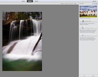
The first and most obvious update to the Elements 11 suite is the
interface. Adobe has moved from a mostly black backdrop to a mixture of medium and light grays. This seems like a step backwards and
against the direction the company has been taking with their professional
Creative Suite products. Although
there is an adjustment slider in all of the CS apps to adjust interface
brightness, it’s obvious from the company’s own screenshots that they favor the
darker shades. I have applauded this in the past as a way to ease eyestrain and distraction while performing
photo and video editing. It will
be interesting to see what direction these changes go in other Adobe
applications down the road.
Version 11 has also been rebuilt completely in 64-bit. This is easily detected right at
startup. I compared version 10 and
found that version 11 opened twice as fast on my MacBook Pro 2.66 Core i7 with
8GB of Ram. (30 seconds compared
to 15 seconds) After opening, the
speed is noticeable in everything from previewing effects to full-screen
slideshows. This is a great
improvement over previous versions where the application always seemed a bit
sluggish compared to the OS X native competitor iPhoto.
ELEMENTS EDITOR
 |
| An example of the new high key guided edit |
 |
| Tilt shift guided edit |
 |
| Graphic Novel effect |
 |
| Making routine adjustments is faster with 9 quick options presented |
Other than the organizer’s interface layout (which is significant), there aren’t a
slew of new features to contend with.
Finding images is easier with an “iTunesesque” organization set. You can choose from multiple categories of criteria to narrow down the image search results. The people section is redesigned to
display large thumbnails of each person labeled in your library.
My Elements library contains over 11,000 images and videos, but the 64 bit Organizer performs with exceptional speed. I experienced little delay while jumping back and forth between different events or images that dated all the way back to 1955. The visual similarity search introduced in version 10 is much more responsive in this version. Adjusting the sliders presents the refined results promptly, a welcome relief from the lag time previously seen.
CONCLUSION
Unless you can't live without the dark background of previous Adobe Elements versions, there is no compelling reason to not upgrade to version 11. Adobe has refined their consumer digital imaging product into an elegant and responsive software package worthy of any amateur or even professional photographer's use. I was pleasantly surprised at how speedy the applications opened and operated having used previous iterations of Elements for five years. Somehow, Adobe managed to pack a staggering number of features, both new and old, into a program while still offering users of all levels both ease of use and a heaping handful of digital imaging horsepower. All for the low price of just $99. I highly recommend Adobe Elements 11.


No comments:
Post a Comment